 |
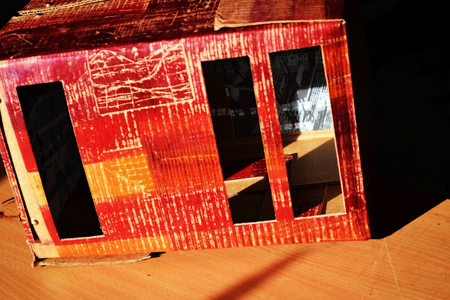
| When the sunlight shines through the slits in the box it causes vertical lines of light to drop on the Architectural ScreenPrints on the inside which is what I wanted so woohooo! |
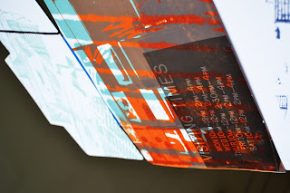
Inside the larger boxes are my Screen Prints, the idea is that when you look through the slits you see the screenprints which are very strict, gridded & architectural in contrast to the outside of the boxes which are loose collographs/mad!! The project aims to contrast between when we put people and ourselves into boxes and when we go feck it, get out of the box and stop limiting ourselves!
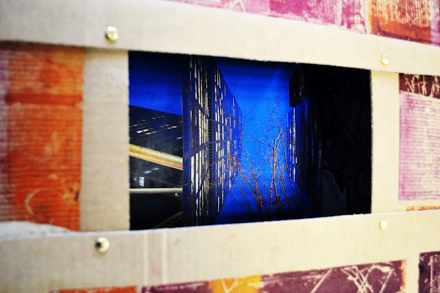 |
| Inside some of the boxes are photos I took in NewYork showing the idea of how we put people into boxes in the city, living on top of each other. |
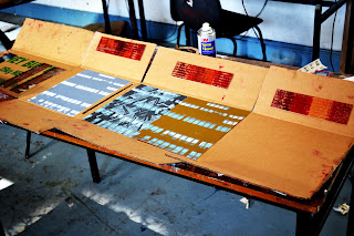 |
| Adding the ScreenPrints to the inside of the box |
With these boxes I wanted to mix the idea of Inside/Outside, they are left open so you can see both the screen prints and the collograph on the boxes.
Hanging from the ceiling and moving...
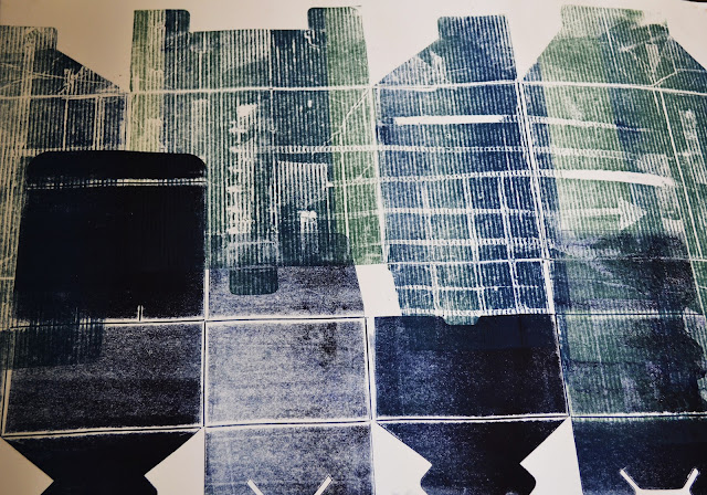 |
| Carving into the actual box and using it to print on paper, fun times!! |
Collographs...
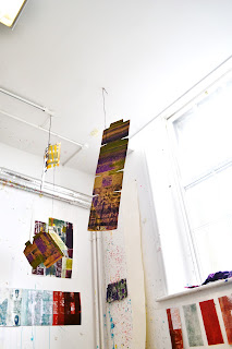 |
| Playing with how to hang the boxes, they're moving which look s pretty good cus it changes from screen print to collograph as the box moves, gets me everytime haha!! |
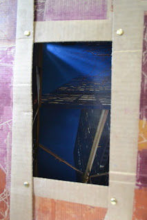 |
| Looking into the city in a box! |
 |
| Just numbers in a city? |




No comments:
Post a Comment